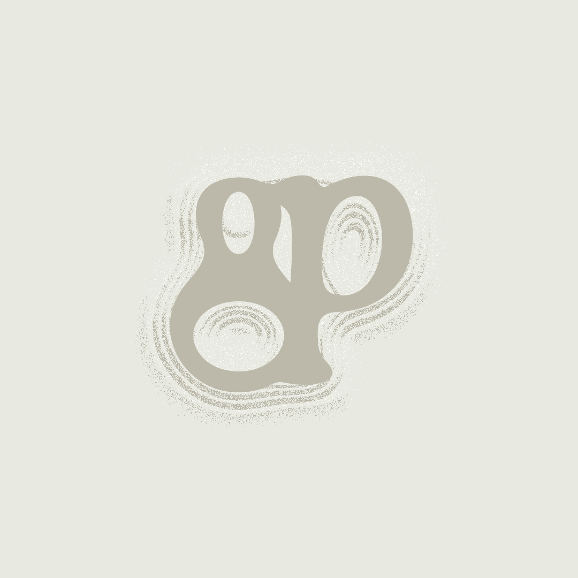

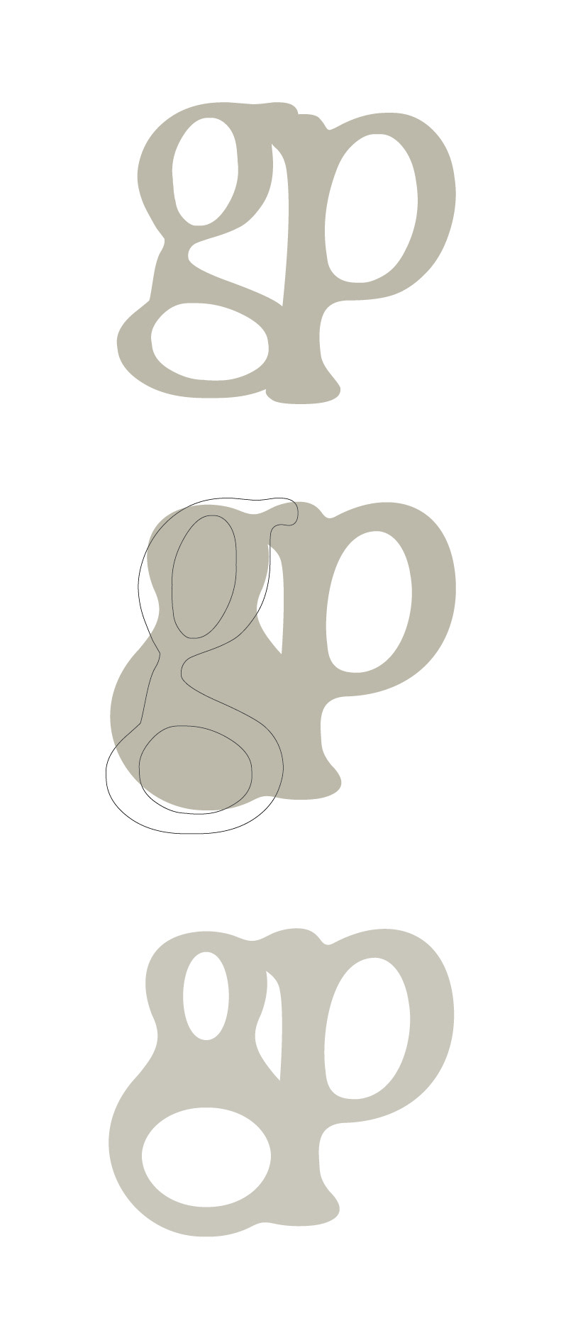
Gravelpond creates natural swimming pools. I drew inspiration from the lowercase ‘g’. I experimented with the shape until I achieved a result that balances between the distinctive teardrop-shape of the Gravelpond pools and the characteristic curves of the ‘g’. The chosen base typeface complements this beautifully with its flowing and organic appearance.
I deliberately chose not to use the color blue, as I often find it more interesting to explore graphic solutions that are less obvious, allowing me to avoid clichés.
The animation was created using After Effects.